Data Problems with Piketty’s Capital/Income Ratios
tags: Phillip W. Magness,Thomas Piketty
The post that follows is a bit more technical than my other posts on the data problems with Thomas Piketty’s Capital in the 21st Century. It also involves a more complex piece of his data, though one with significant implications to his general theory about a hypothesized inherent tendency of capital returns to outpace other earnings.
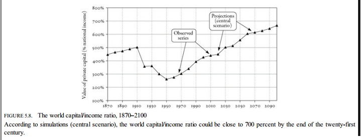
With that in mind, let us turn to Figure 5.8, which also repeats later in the book as Figure 12.4. This figure is a familiar one from the discussion around Capital as it is purports to illustrate a “U-shaped” historical relation between private capital and national income.
Since much of my examination will follow Piketty’s own explanation of how he claims to have obtained these data, I will also let him describe the implications of this graph in his own words (pp. 195-6):
In short, this chart is provided as something of a validation of Piketty’s ubiquitous assertions or “laws of capitalism” – specifically that r>g, or an expectation that the return on capital will exceed the rate of economic growth, and an extended implication via his “second law” wherein he specifically predicts an increase in the ratio of capital to national income over time, as manifested by a mid 20th century dip followed by a rebound to a Gilded Age level of ratios.
Let’s turn next to Piketty’s data sources for Figure 5.8, as this is where some problems start to show through. It helps to divide our examination into two separate components of his data construction: (1) an estimation of private capital/national income ratios for regions of the world with available data to this end, and (2) an aggregate world capital/income ratio over time, essentially obtained by weighting the regional figures by their estimated percentage of total world output.
I. Capital/Income Ratios by Region
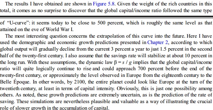
For part (1), it becomes immediately apparent in Piketty’s excel files that his data set has multiple gaps. Assuming his sources are correct, he only really has reliable data for North America and Western Europe throughout the time frame under consideration, plus Japan and Australia/New Zealand since 1970. Piketty partially concedes this issue in his book (p. 195). That noted, the data gaps may still be more of a problem than he wishes or recognizes. The following screenshot shows his capital/national income ratios by region, with the non-highlighted cells representing actual data points and the pink highlighted cells representing data gaps:
Referring to these gaps, Piketty states: “For the period 1870-1990 there are no truly reliable estimates” for South America, Africa, and Asia excluding Japan. To reconcile this gap, he continues, “I have simply assumed that the overall level was about the same.”
This is not entirely accurate though. Notice in the image above that the highlighted cells do show variation over time – usually by increments of 25 percentage points, though in some cases the swings are 100 percentage points or more in the course of a decade. Where did Piketty get these numbers? As best as I can discern from his annotation and spreadsheets, he follows a bad habit that appears elsewhere in Capital in the 21st Century where data gaps present a problem: he simply made them up.
Now it should be duly noted that the missing/made up regions are a minority component of world economic activity for the period under consideration (and Piketty does note this - he suggests in his book that they comprise “just over a fifth of global output throughout this period”). I’d answer that a data set that is consistently missing over 20% of the world’s economic activity (and probably more than that when one considers that his numbers for Japan &Australia-New Zealand only cover the past four decades) still has a sizable gap. It is also the type of gap that would tend to commend an abundance of caution in using the resulting trends as the basis of a boldly asserted, grand unifying theory of the effects of capital ownership in the global economy.
To add a further complication, Piketty’s annotation makes it difficult to discern where exactly he obtained the figures he provides for the cells I highlighted in pink…outside of simply making them up.
This points to a larger problem of missing transparency in his annotations for Figure 5.8 though, and one that potentially compromises it beyond an acknowledged but obscured gap in his data for regions outside of Western Europe and North America.
In particular we still have to figure out how he weighted Western Europe and North America as he calculated his world capital/income ratio data set. Turning to Piketty’s technical appendixes for an answer to this question, we don’t find much at all to build on. Here is how he describes the genesis of Figure 5.8 in his technical appendix to Chapter 5:
“The series used to construct figure 5.8, replicated in the book on p.196, are available in Table S12.4 (see appendix to chapter 12). All the details about the assumptions on which the series are build, especially for the period 2010-2100, are specified in the book, as well as in the corresponding excel file.”
In other words, following these instructions leads us to a promised description in the technical appendix for Chapter 12:
“The series used to construct figures 12.4 et 12.5 are available in table S12.4 and in the corresponding excel file. These estimates are based on assumptions already presented in chapter 5 and in the appendix to chapter 5.”
…which sends us back to the appendix for Chapter 5 again.
Rather than providing the minimal level of sourcing and annotation one might expect from a scholarly publication, Piketty leaves us with instructions that are entirely opaque, not to mention something reminiscent of a “choose your own adventure” novel that becomes mired in a circularity paradox.
II. World Output Distributions
We may nonetheless work backwards in his excel sheet to find an explanation of what is happening in part (2) of the data construction process mentioned above, his estimates of a world capital/income ratio by weighting his regional ratios to their estimated historical percentage of world output.
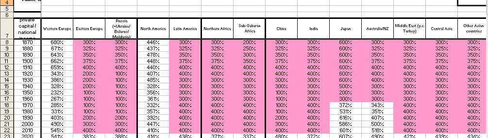
Piketty does this by presenting what appear to be decennial estimates of the world output distribution across different regions. They appear as follows on his spreadsheet:

For purposes of this consideration, I am only looking at the historical part of Figure 5.8/12.4. I have again highlighted some of the cells in this spreadsheet to differentiate their sources. The non-highlighted cells are based on a data source, which I will return to momentarily. The yellow highlighted cells are actually data gaps that have been interpolated or smoothed by averaging.
Note that such techniques are not uncommon in historical time series, especially where data is hard to come by. I bring these up for two reasons though as they pertain to Piketty’s figures.
First, of the 14 decennial data points between 1870-2010 he only has actual data points for 6 of them. The remaining 9 decades are interpolated and smoothed into his overall trend lines. This strikes me as an exceedingly slim number of data points upon which to base a bold and sweeping interpretive argument of any sort.
Second, in filling his gaps by way of averages, Piketty quite strangely assumes that the percentage-based distribution of world output by region remained constant and in regional parity throughout the missing decades. Keep in mind that Piketty’s gaps include such events as the Great Depression, World War II, and numerous smaller disruptive events that might be reasonably expected to alter these distributions.
Piketty’s annotation here is again opaque, as he gives no clear indication that he has employed these gap-filling methods or that his underlying data set is so sparsely populated (again, he only has data for 6 decades out of the 15 included in the historical portion of his figure). His excel sheet does at least give a source though, directing the reader to his Table S1.1 from another spreadsheet.
Turning to that table, it becomes clear exactly how thin Piketty’s data for his regional output distribution weight actually is. It appears that he does not even have 6 decades out of 15, but only 6 years out of 150. These in turn are represented in the chart above as decennial figures for the nearest decade (thus 1913 becomes the entire 1910s data point and so forth)

His source here is independent, having been calculated from the Maddison historical world economic indicators database. As we can see from the screencap above though, the gaps are even more pronounced than what were presented as decennial summaries in the chart derived from them. In fact the largest gap – 1913-1950 -has now shed any meaningful attachment to the 1910s in cumulative, and may be said to encompass both World Wars and the Great Depression. To assume that the regional distribution of world outputs moved in fixed parity throughout these events seems highly suspect.
Conclusions:
Historical data sets are often far from ideal, and Piketty’s case is no different. It would be unfair to hold the absence of data itself against him when such data may not even exist. Scholars who work with historical data must often accommodate gaps in their existing numbers, or even the lack of any reliable figures for an event, region, or period of time. To get around this problem, they must estimate numbers, find acceptable proxy measures, and interpolate and smooth over missing dates on their time series. And to some extent, Piketty enlists several of these strategies to his work.
Piketty’s problems are certainly related to his data gaps, but they arise less from their existence per se and more from how he chooses to proceed upon encountering them. In the case of Figure 5.8/12.4, the following criticisms taint his work:
1. Piketty’s underlying historical data are of much lower quality than he lets on, sometimes exceedingly so. Even as much of this is beyond his control due to the simple non-existence of reliable historical stats for some of the phenomena he wishes to measure, large gaps still pervade his raw numbers, and in some cases they interact with other sets of data exhibiting similarly pervasive gaps.
2. Piketty is routinely less than transparent about the existence of gaps in his data, and the specific the techniques he employs to work around them. His spreadsheets show the widespread use of averaging, interpolation techniques, and other corrective and smoothing methods, but these are seldom indicated in the charts themselves, which gives his average reader an illusion that they are substantially more complete and accurate than their own source data.
3. Piketty has a habit of drawing bold assertions and far-reaching historical interpretations out of his graphs and other data work. Many of these claims are asserted with far greater strength than their comparatively weak and gap-filled source material merits.
4. Piketty’s routine annotation and citation practices are utterly opaque. At their worst instances they fall below the threshold of acceptable work for an undergraduate paper, let alone a scholarly book on a university press. The cumulative effect may not be of conscious design, though it is nonetheless certain: insufficient annotation obscures many of the aforementioned weaknesses in his data, and makes it more difficult to independently examine and replicate his results.